
Stop Being So Bold: Iterative Design’s Many Perks
Trying to design effectively for your users? You can't keep blowing up bridges to create a new path. Here's why iterative design is a philosophy for your association to follow, no matter the platform.
When done correctly, great design can be an important differentiator.
I was reminded of this recently when I stumbled upon an article in Current highlighting the reason NPR programming has such a distinctive sound—less bassy and much clearer than many other news programs.
NPR’s programmers made a conscious decision to consider the quality of the microphone and the acoustics when putting together on-air programming. Shawn Fox, NPR’s senior director of audio engineering, explains:
The reason NPR came to this standard—and this was decades ago—was because most of our listeners are consuming in an automobile or with something else in the background. Back in the day, and even to some degree now, you roll down those windows and hear those low rumbling frequencies. We wanted our voices to get above that so that they could be clear, open, and understandable to improve our storytelling.
It’s a concept that just works and has stood the test of time. And this specific example of good audio design is a perfect discussion point on the thought process of creation.
How Design Evolves
That NPR link wasn’t the initial spark for me. Rather, it was a roundup called Great Apps Timeline, which shows the evolution of popular iPhone apps.
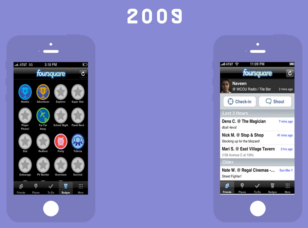
Some apps, like Foursquare (which notably pivoted to a useful Yelp-like offering in 2014, and I’m a big fan), look nothing like they did when they started. (In particular, LinkedIn’s design evolution is bound to give you whiplash.)
Others—particularly Instagram, WhatsApp, and Pinterest—have evolved to a degree to match the design changes in iOS itself, but their design changes have been relatively muted. If you use Pinterest for iOS circa 2011 and then hop into Pinterest for iOS circa 2016, you may not even notice how different the experiences are right away. If you break it down, these apps are very different, but they feel similar, and that’s an important distinction.
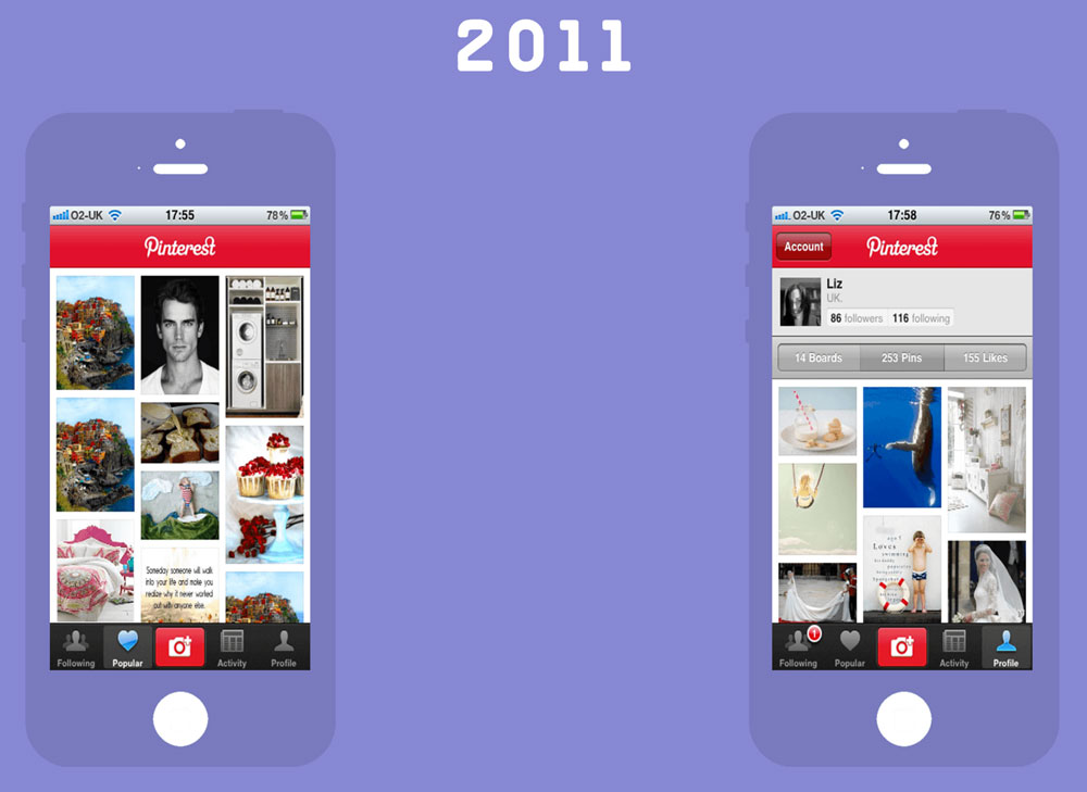
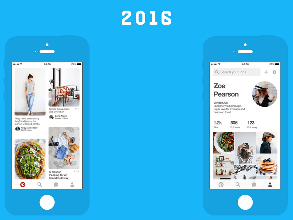
The power of Pinterest’s strategy is that it values “evolutionary” or iterative design over “revolutionary” or more dramatic approaches.
This is not easy: As new features get added, the company has to figure out how to keep all those things simple without removing the flow that people love.
The problem, of course, is that an iterative strategy can hold you back from more bleeding-edge design approaches, such as those shown on the anonymously curated design platform SiteSee. You can’t be one of the cool kids if you’re not creating the boldest, most forward-thinking thing out there, can you?
four Steps and more
But here’s the truth of the matter: You’re not building for beauty contests, and the cool kids you’re trying to impress are your own users. And the strategy that Pinterest has traditionally used for its own website and app offerings is ultimately the one you want to borrow from.
The web development firm Zurb, which makes one of my favorite responsive design frameworks, has a really great, dead-simple, four-step process for how great iterative design works:
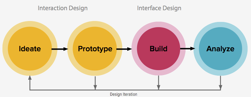
Zurb’s approach is field-tested: The firm has clearly spent much time focused on the ideation process. But as you can see, ideation feeds on what it learns through the other parts of the design iteration process, particularly the fourth element—analysis of how that design goes over, both within the office and with the users it’s trying to reach.
“When you’re building designs and iterating as soon as possible, it helps you find your success faster,” the company explains on the Zurb University section of its website. “Rapid iteration is just as important to your standing success as having a genuinely great idea.”
But the true secret of Zurb’s approach is what comes after these four steps and the product goes into the world at large. The process doesn’t end there.
“Iteration is a systematic, cyclical design loop. Products are prototyped, tested/analyzed, refined, and prototyped once more—where the process starts all over again,” Zurb explains. “And it doesn’t end once we have a finished product. We iterate long after we launch, improving functionality and adding complexity.”
(If you need this explained to you, or perhaps someone you know, in the simplest terms possible, this Design Taxi post from last week is a great place to start.)
This process is one worth considering for your organization’s digital efforts, no matter how big or small they are.
Digg.com: When Iterative Design Won Out
The go-big-or-go-home approach has some clear weaknesses, the biggest being that it takes a lot of time to start over, and starting over can be alienating.
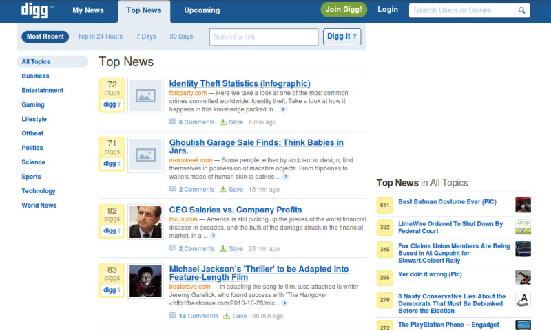
For example, the infamous 2010 redesign of Digg.com—its fourth major redesign in five years—famously upset its users by changing its functionality and led to a sharp decline in traffic for the company.
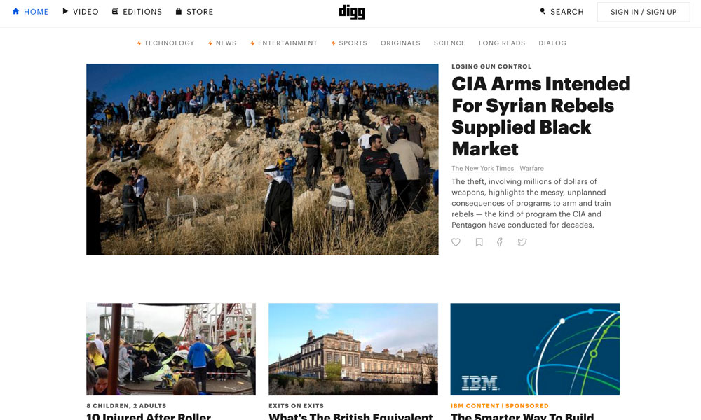
In a matter of two years, the company had been sold off for pennies on the dollar, and its DNA had completely changed. Its new owners, BetaWorks, have since focused on a more editorially driven, iterative design. There has been one design in four years, and the company talks about the website in terms of iterations—constant improvements that make it better.
https://twitter.com/freddurst/status/296867959467552768
You can’t compare the original Digg to the new one, but you can compare their design strategies. Ultimately, despite low initial expectations, the public has embraced the new Digg in part because it has figured out a way to innovate frequently with its offering without rocking the boat every 12 months or so.
Start With Good Design
But the thing is, that iterative approach only works if you have a strong foundation.
Let’s go back to the example I started with: Since 1971, NPR programming has taken on a variety of forms and styles, but it has kept its fundamentals in place. It hasn’t changed dramatically in 45 years, though its strategy has evolved as necessary to make room for stuff like the internet and podcasting and to ensure that it’s not ignoring important cultural trends that define its relevance. And, of course, its distinctive sound provides a nice foundation to tie everything together.
When it comes to your association’s design strategy—not just your branding, but what you represent to your members—do you have a strong foundation, or are you starting over every three or four years?
Here’s a tip: If you’re always evolving, you’re never stuck starting over.
(iStock/Thinkstock)
Ernie Smith is a former senior editor for Associations Now. MORE
Got an article tip for us? Contact us and let us know!


Comments