
The State of Email Design Stinks
If you'd like to push the envelope with an email message, you might be in for a world of pain. Like web design in general a decade ago, email design remains mired in a set of inconsistent standards and poor rendering support by popular clients. The result is that email marketers are often stuck playing it safe.
One thing you may not be aware of about the work I do on Associations Now is that it extends all the way to the daily email we send out. My hands are all over that thing.
Generally, this manifests itself in the work of putting together the newsletter and making sure every link is in place, but way back when AssociationsNow.com was still deep in pre-launch mode, I straight-up designed the newsletter’s visual look.
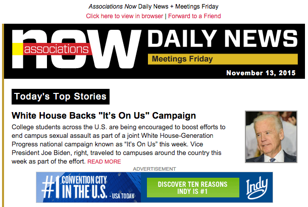
Judging my own work, it’s not the prettiest thing in the world, but it’s a workhorse that does its job—sending links to your inbox, keeping you informed about the world of associations and nonprofits—pretty effectively.
That’s about as much as you can expect out of most emails these days, for better and (especially) for worse. The reason for this comes down to the technology: Email design has long been one of the internet’s dark arts. Email is an essential form of online communication, especially when it comes to marketing, but it’s often received short shrift from a technical standpoint. And as a result, email design tends to be fairly conservative out of necessity.
Another platform commonly relied on for marketing purposes used to suffer from this same kind of problem, and for similar reasons. See, much like email nowadays, the open web used to be held back by applications that introduced a host of technical issues. We’ve largely gotten past that point, thanks to steady competition among Apple, Google, Microsoft, and Mozilla.
But email still has many of the same problems that used to make web designers wince. Creating an email that works across multiple clients may, in some ways, be even worse than web design was during the era of Internet Explorer 6, due to the technical constraints, especially these:
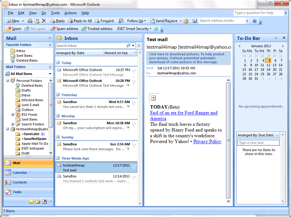
Outlook uses the rendering engine Microsoft Word uses: This is perhaps the biggest problem in the grand scheme. While Internet Explorer has improved over the years, Microsoft has chosen to rely on a rendering engine more familiar with its users at the cost of design capabilities for those who send emails. In fact, Outlook has actually regressed on the rendering issue—the app used to rely on Internet Explorer’s rendering engine, only switching to Word in the past decade. As a result, emails can look perfect in a 15-year-old version of the client but break in the latest version, because the client requires the use of Word-specific coding techniques for basic features such as background images. The result is hurting email design as a whole. “Many developers avoid working on email because of its horrible productivity compared to web development,” FreshInbox’s Justin Khoo wrote in a LinkedIn post earlier this year.
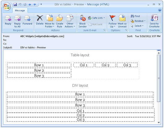
Layout needs to be done using HTML tables: In the late 1990s, the first attempts to create visually appealing websites involved the use of tables. It kind of worked, but tables were poorly suited to the task. To get images and type in the right place, tables often needed to be nested inside of other tables, creating complex code that becomes a challenge to update. When it comes to email, however, tables are not only not dead, they’re pretty much required if you want to do anything that stretches beyond a simple text message.
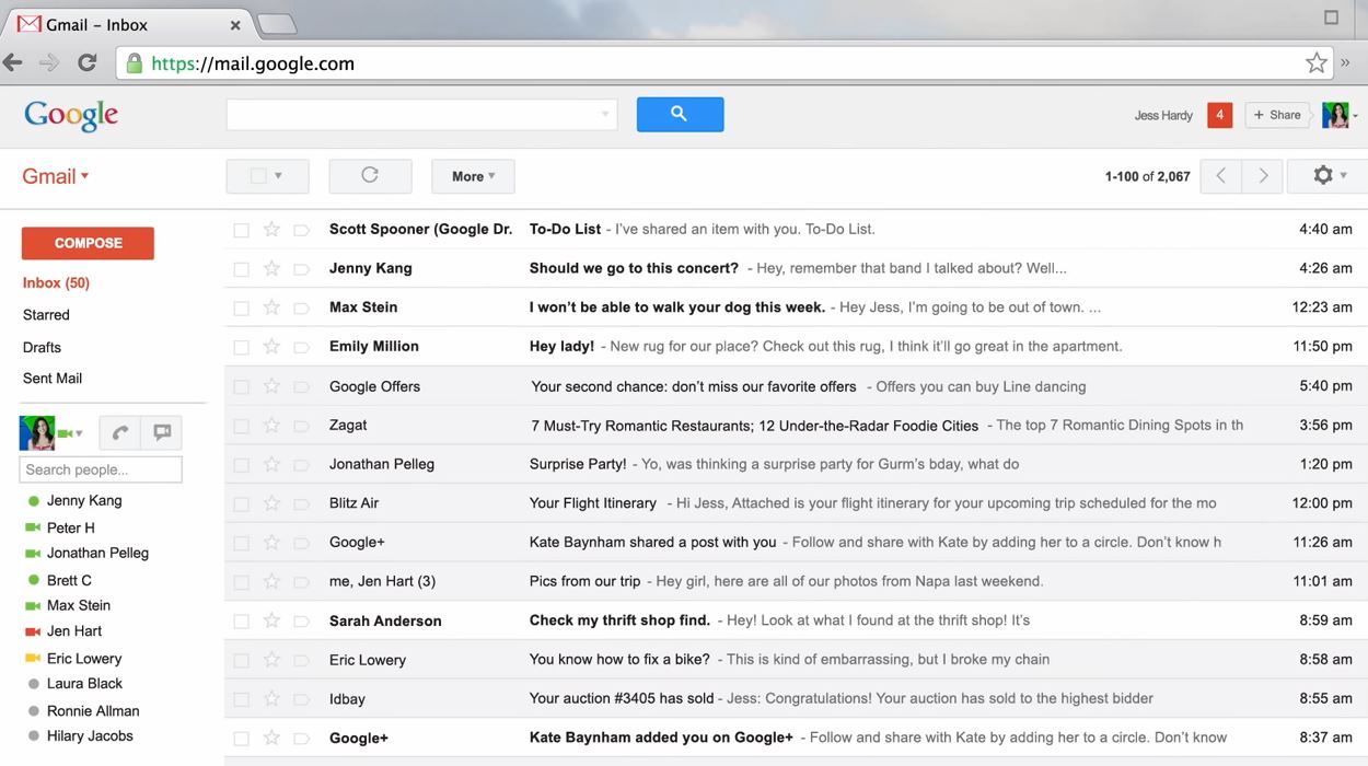
Spotty CSS support, especially in Gmail: To be clear, however, the HTML rendering problem isn’t just limited to Microsoft. Google and its popular Gmail client also deserves a big chunk of the blame. The search giant is known for its forward-thinking approach to organizing emails and building web browsers, but it has failed to support a basic element of web design in its email client since launch: Properly implemented support of Cascading Style Sheets (CSS). Unlike most of its competitors, it’s not possible to externally link a CSS file, nor is it possible in most cases to separate CSS in a separate part of the document, meaning that styles have to individually be added inside the HTML. Like tables, this creates complexity and bloat inside of the HTML files, making them difficult to modify and edit. (Google generally has claimed that its limited email rendering capabilities are related to security concerns.)
Lots of quirks across the board: An email that looks good in Gmail may not look good in Yahoo Mail or Outlook.com, and features that you may expect email clients to natively support, such as animated GIFs, may inexplicably be missing. (If you like GIFs, folks, Outlook is not your bag.) And while responsive emails are definitely possible, the spotty CSS support means you’re getting hacky if you want to get responsive.
Apple is perhaps the only company with an email client that doesn’t cause headaches—because it essentially renders messages using the same engine that powers its Safari web browser.
Thinking Creatively
There have been some, however, that have turned such limitations into virtues.
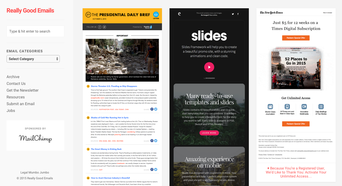
The newsletter Really Good Emails does a really great job highlighting the potential of good email design—and it clearly shows that marketers are thinking of paths forward for their emails.
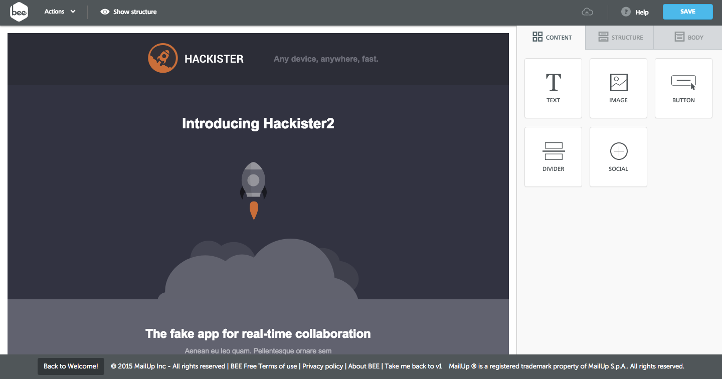
Likewise, email design tools have improved in recent years, with visual apps such as BeeFree working to hide the ugly kludges needed to make an email render properly behind an easy-to-use interface.
Other platforms are simply trying the simple-but-good approach. The email service Curated, which I profiled earlier this year, basically gives every user an ultra-simple workhorse template that can be modified slightly, but otherwise maintains its basic look. It’s an effective strategy for its use case.
And some, simply put, are just getting incredibly clever. In recent years, ace email designers have cobbled together an array of dark-magic techniques that cleverly translate techniques used around the web to email, such as responsive design and the ever-popular “hamburger menu”. And they’re doing their best to share the knowledge, one magician to another.

A new startup in this vein, Rebelmail, has drawn some early buzz for figuring out ways to add interactivity to emails. The company says it has figured out ways to render image carousels, drop-down menus, and even multipage layouts into email messages—though with the caveat that not everything works everywhere.
Even with those willing to try innovative techniques to push forth email design in many of the same ways as the web, the result is somewhat unsatisfying, because of the amount of work that you know probably went into the end result.
Creating a nice email shouldn’t be alchemy, but the lack of coordination between email-makers ensures that it will be for years to come.
Is There Hope for Change?
This state of affairs is pretty rough if you rely on email for marketing in any way, shape, or form. It creates a situation where you either will waste massive amounts of time testing for every quirk in existence, or you will design emails so simple that your brand barely even has room to make an impact.
(The latter case can be seen in a number of digest emails, including those from Vox and BuzzFeed, two media outlets generally praised for their design.)
But things are starting to improve: FreshInbox’s Khoo hit a nerve with his complaints about Microsoft’s poor Outlook-based rendering, leading Microsoft’s Outlook team to reach out and ask the email design community for feedback on how it could improve things. It’s a promising situation that Khoo is now hoping to replicate by calling on Gmail’s team to step up in a recent TechCrunch post.
“Think about it. If developers spend hours testing their emails to ensure they render nicely in Gmail, how will they find the time to experiment with cool stuff like Gmail’s email enhancements?” Khoo wrote.
Associations, being as reliant as they are on emails as a marketing and communication tool, are also in a place to speak up on this issue. Email marketing is so essential to associations’ needs that they should start caring about how to improve this state of affairs. When so much quality assurance is required just to test an email, it often limits the nature of what you can do with the emails.
Web design has improved immensely in recent years off the back of better standards. Why can’t email design follow the same path?
(iStock/Thinkstock)



Comments