Go Radical: Could MySpace and Digg Be Role Models?
In recent months, such previously prominent services as MySpace and Digg have attempted drastic revisions in their designs and approaches. Should your association follow suit?
Sometimes, trying to kick-start an engine just isn’t worth it anymore. You just have to buy a new car.
A strong framework—focused less on clicking off every checkbox and more on serving end-user needs—is how you get there.
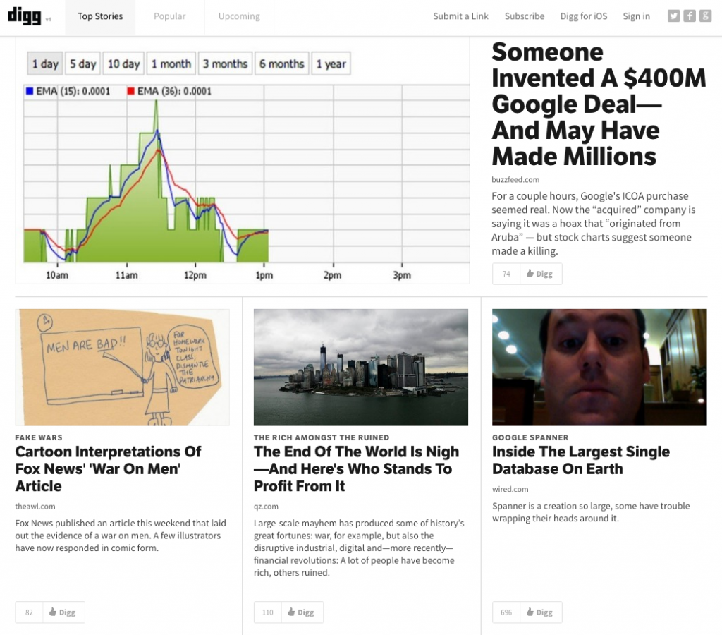
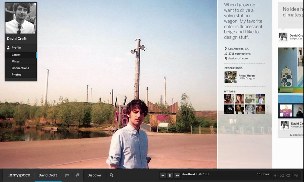
In recent months, two legendary Web 2.0 icons—first Digg, and more recently MySpace—have, under new management in both cases, chosen to boldly reinvent their sites. In Digg’s case, it simplified the format, got rid of a lot of the bulk, and focused on its strength as a news aggregator; in MySpace’s, they took an approach that was downright radical: moving to a blocky horizontal format that focused on its strength as a music platform.
Both of these sites needed the reinventions badly, particularly MySpace, which had long ago lost its footing against Facebook due to a lacking technological approach to the product. Digg, if anything, suffered from the opposite problem; it iterated so severely that it lost its edge against the spartan-looking Reddit.
Time will tell whether these approaches will work, but there’s something smart happening in both cases. Associations, especially those with a grasp on legacy, would do good to take heed of MySpace and Digg’s new approaches.
The New Digg: Less is more
When TV personality Kevin Rose introduced Digg to the masses, it immediately grabbed a foothold in the market, thanks to its easy-to-grasp concept and strong focus on commenting.
But when a changing market—caused by Twitter as much as Reddit—forced the site to evolve, Digg redesigned in a way that angered end users and led them to move to its competitors. Eventually, the parts were sold off, with BetaWorks buying Digg’s name and content for a fraction of its original price, and essentially starting over with a clean, simplistic, human-curated design.
Four months later, some early results are in: BuzzFeed reports that the site is slowly becoming a bigger traffic draw once again, and the site also has a monetization model in place. It’s too soon to tell, however, whether the site will reach its initial heights.
The New MySpace: Bigger, Bolder
For years, MySpace was shorthand for “bad design.” Users and bands could clunkily modify their pages in a way that allowed for user freedom but an experience that was far from consistent. (After the fact, the poor design was blamed on necessary ad placements enforced by high-priced contracts former owner News Corp. signed with Google.)
Years later, Mark Zuckerberg’s consistent (if complex) Facebook holds together as a piece, which eventually gave it an advantage in the marketplace.
Enter Justin Timberlake. One of the new owners of MySpace, the pop star and actor recently said the relaunch focused on the people still using the site—music fans or musicians themselves—instead of trying to retake Facebook’s territory.
“You hear so many times from an artist, ‘How do I bridge the gap?’ ” Timberlake said, according to the Los Angeles Times. “It’s this type of interaction that [lets them] connect even closer to fans.”
While the site, inspired by Pinterest and Microsoft’s Metro design language, isn’t available for public consumption yet (request your invite here), the framework is a stark improvement from prior attempts. It may help MySpace get its (wait for it) sexy back.
Create a Strong Base, Then Iterate
But here’s the secret of a “radical” redesign: Once you build out something bold and completely out there, the next steps aren’t quite so radical. To put it simply, the radical approach is how you think about what you just built. Rather than waiting a couple of years and doing it again, use the framework as a method for constant, iterative improvement.
The reasons Digg and MySpace’s rethinkings will work better than their older approaches, even if the users don’t come back at the same clip, is that they’re built to breathe and grow in an iterative way.
These designs don’t focus on the past but rather emphasize the things they do well, and, to put it simply, the designs are implemented in a way that makes room for long-term growth. They can build on top of these. More association sites could benefit from a clean, iterative approach — as long as they’re given the right foundation.
Recently, at an Online News Association (ONA) event in D.C., I heard NPR Digital Design Director David Wright speak about the value of agile development—iterating in small pieces rather than trying to go overly massive with web development plans. Instead, he says, structure your staff to be proactive and take on projects in smaller pieces. (Or, as his presentation, which he also did at the 2012 ONA conference in San Francisco earlier this year, puts it, “If you’re not agile, you’re doing it wrong.”)
Many associations could learn a tip or two from this. A strong framework—focused less on clicking off every checkbox and more on serving end-user needs—is how you get there. Trying to improve the experience across the board? Don’t over-emphasize organizational needs. Step back and focus on what actually makes the design work for your members. And make room for small changes so the big ones aren’t needed quite as often.
The thing is, whether MySpace and Digg can pull off either of these approaches and reclaim their former glory—easier said than done, especially in MySpace’s maximalist case—they’ve both created a strong design that will be much easier to iterate upon.
Can you do the same? Let us know how your redesign efforts are going in the comments.
(iStockPhoto/Thinkstock)


Comments