Organize and Visualize: Turning Member Numbers Into Knowledge
The North Carolina Association of CPAs undertook a year-long project to get its member data both centralized and accessible via interactive dashboards. After all, your member data is only as good as your ability to analyze it.
Once upon a time, it took staff at the North Carolina Association of CPAs as long as 16 hours—two solid business days—to generate a complete report of its key membership statistics, pulled from its association management system and compiled in Excel. “We only did it four times a year, and that was because it took so long,” says Nikki Vann, CPA, director of finance and administration at NCACPA.
Those 16 hours, of course, were merely pre-work. That all came before anyone actually looked at the numbers to see what they meant for the organization.
Our membership manager is ecstatic that she has that information and can click a button and knows that information every day.
NCACPA faced a problem nearly every association faces: As essentially a conglomerate of small businesses, a typical association works in so many data systems that, even if it is diligent about collecting useful data in them, it can be excessively difficult to assemble it all into actionable knowledge.
Debbie King, founder of analytics firm DSK Solutions, says she sees this repeatedly in her work with associations. “The thing that you hear everybody say … they’re all complaining how hard it is to get the data out, and that’s because the systems are optimized for getting the data in,” she says.
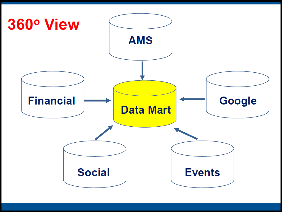
Starting in 2014, King began working with Vann and NCACPA to centralize the organization’s data storage—not by replacing or consolidating existing systems but rather by building a “data mart” to integrate with all of them (as illustrated in a presentation slide from King and Vann’s Learning Lab at the 2015 ASAE Finance, HR & Business Operations Conference):
The integrations with each of the systems are automated to update nightly, and they don’t pull every last piece of data—just the data points NCACPA deemed useful to its intended analysis. “The idea here is that data mart becomes the single version of the truth,” King says.
Data centralization was necessary, but it was only half the story. The next step was to build visualizations to make sense of the data. This, according to Vann, is where it got exciting.
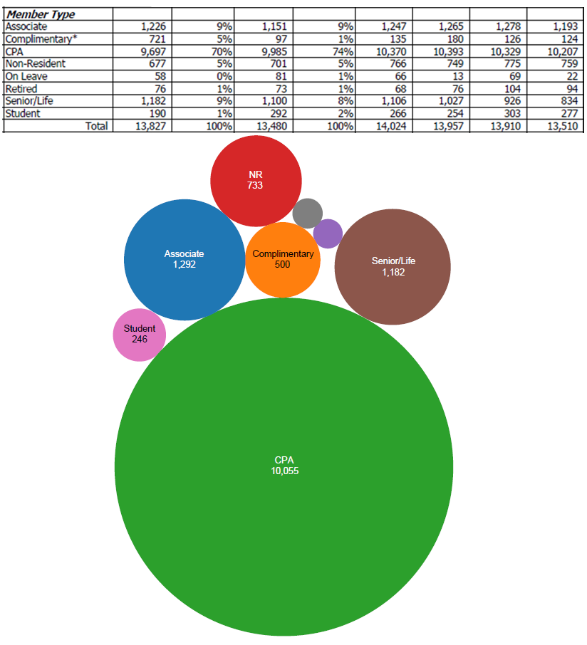
NCACPA used a tool called Tableau to build its new membership dashboards. The dashboards are linked to the data housed in NCACPA’s data mart, and they show the latest data in just a few clicks.
Below is an example of before and after. On the top is the old Excel table NCACPA used to report totals for its various member types. On the bottom is the bubble graphic created in Tableau.
Of the old table, Vann says, “You probably looked at [it] and wanted to bang your head against the computer screen.” The bubble graphic, on the other hand, is easier on the eyes. “Very quickly you can look at this and start seeing things already and questions you want to ask about it,” she says. “Our membership manager is ecstatic that she has that information and can click a button and knows that information every day.”
NCACPA’s member engagement dashboard is somewhat more complex, but it’s also more dynamic. (Note: Both this image and the bubble graphic above are static screenshots provided by NCACPA, but the actual tools are interactive.)
The North Carolina Association of CPAs’ “New Member Engagement” dashboard allows staff to view current and past member data, filter by member type, and drill down into engagement activity and individual member records. (Source: Nikki Vann, NCACPA)A quick walkthrough: Across the top are yearly segmented totals for new members. On the bottom left, yearly tracking of the percentage of new members who engaged in particular activities (shaded so that darker green means a higher percentage). On the bottom right, the list of new members’ names with organization, email, and whether they are still members.
Clicking on a year or member type in the top half filters the results shown in the bottom half, meaning the user can “drill down” into the numbers. For instance, choosing new members from 2011 adjusts the activity section to show tracked activity both before and after 2011, meaning NCACPA can see what type of engagement typically is a precursor to joining and what activity new members get engaged in first after they join. “What we also wanted to see was, what was the impact of them becoming a member? How did it change their behavior?” Vann says.
The impetus for building better data analysis was a set of strategic initiatives set forth by NCACPA’s leadership related to professional development, member value, and communication. Vann and colleagues knew they needed better data to execute those strategies, but they decided to invest the time, energy, and money to do it right. “Everybody was champing at the bit to get this done,” Vann says. “My comment was, ‘Well, we’ve been in business for 90 years, and we’ve been doing pretty good based on intuition and gut, and another year of getting this implemented, I think we’re going to be OK.'”
Vann has also worked on getting fellow staff comfortable with the dashboards and accustomed to working with a data-driven mentality. “When you have the opportunity to work in it, everybody sees the potential and power, but it’s just making it a part of our daily lives,” she says.
How is your association building its capacity for data analysis? What are the biggest challenges? Have a cool member-data viz to share? Let us know in the comments.
Editor’s Note: This post was updated June 27, 2019.
(iStock/Thinkstock)


Comments