A Simpler Look at Risk
It can be hard to see where threats to your association are coming from, but one organization has charted a way to help its board see them more clearly.
How much are you thinking about risk?
For a lot of associations and their boards, the answer is probably not enough—in many cases it’s likely that the risk conversation is a short-term concern about a revenue dip in one segment or another. And even if everybody gets behind a more strategic discussion like a SWOT analysis, the “threats” portion only accounts for a fourth of the conversation.
Much of this avoidance of talking about risk might be chalked up to simple fear; talking about the things that threaten the livelihood of an organization and its members tends to stoke anxiety and disagreement. Another reason, though, is that risk is a hard thing to quantify and visualize. An environmental scan can highlight points of concern for an association, but it’s not always easy to see at a glance just how concerning they ought to be.
Risk assessment precedes action.
This is a problem that John Roberts has been working on for a few years now. As CEO of the Natomas Basin Conservancy, a foundation that administers the preservation of plants and wildlife in the northern California region, he’s struggled to find ways to emphasize the biggest concerns to his board members. As a board member of a publicly traded communications company, Roberts had risk top of mind, but it was less so in his nonprofit travels.
“There’s no skin in the game with a nonprofit board,” he says. “You don’t have stock options, or restricted stock units, or equity, or some of the legal exposure that you do in the for-profit world.”
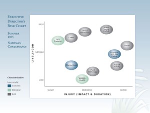
The idea Roberts arrived upon was a chart: An X-Y axis upon which he’d plotted the biggest threats to the organization—the likelihood of an event happening mapped against the intensity of its impact. The original versions of the chart, he said, were busy, with a lot of color-coding and an overabundance of risks under discussion. He shared it informally with the Conservancy’s board, but it was mainly a tool for himself and staff.
About three years ago, he began making a simplified version of the chart a regular part of board discussions. “My goal was to get 10 people serving on the board of directors, plus my staff, to grasp it pretty quickly, and simply,” he says.
The image below shows a recent risk chart for the Conservancy:
There’s not a lot of quantified information on the chart, which is by design—it’s meant to be more of a heat map for leaders. “None of the risk factors are easily reducible to correlation coefficients or probability theory,” Roberts recently wrote in an article discussing the chart. “The illustration’s subjectivity is simply intended to confer to staff and board members what its executive officer is thinking with regard to the big issues at a set point in time.”
Even so, Roberts comes prepared to defend his rationale for the placement of each risk factor. That’s had a practical impact, Roberts says. For instance, highlighting concerns about property crimes in the region it administers prompted the board to take stronger action on insurance. “It’s an opportunity for us to demonstrate to the board all of the duty of care that its staff exerts to keep the organization running smoothly and keeping it off the front page of the newspapers,” he says.
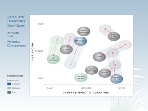
The thing about risk, though, is that it usually doesn’t stay in one place—today’s risk concern likely wasn’t even on an organization’s radar five years ago. Roberts himself makes a point of updating the chart quarterly, though he doesn’t necessarily share the updates with the board at every meeting. “If events cause there to be changes, they’re going to see it more frequently,” he says. Below is an image showing how risk factors have shifted:
The chart highlights Roberts’ argument that strategic moves must be preceded by a sensible discussion of threats: “Risk assessment precedes action,” he says. “That is what we’re trying to accomplish with this in the fewest possible words.”
But be careful about the words that you do use, Roberts notes. Board members, typically in no hurry to discuss risk in the first place, might bristle at a pet project or their own business being mentioned as a “risk” on a chart. “Think very carefully about how the risk element bubbles are titled, and if you get questions about those titles from board members, choose carefully the words you use to explain them,” he says.
How do you talk about risk at your association, and how do frame the discussion to make it manageable for staff and volunteers? Share your experiences in the comments.
(BrianAJackson/ThinkStock)


Comments