Time to Rethink Your Logo? Start Here
Associations with long legacies face difficult questions on positioning when a logo refresh comes up for discussion. Here’s what the National Grocers Association learned from its recent rebranding exercise—and how members got a say in the process.
Perhaps your association has a brand identity that has been around for decades, and there’s a lot of value attached to it—but you want to refresh your design. How can you do so without losing the identity that helped you get where you are today?
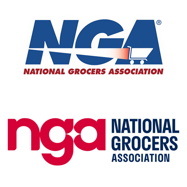
The classic NGA logo (top); the updated logo. (via National Grocers Association)
Recently, the National Grocers Association went through just this exercise. The result: an elegant new logo and brand identity—one that highlighted what its members care about while maintaining touchstones of its past identity.
Given that NGA’s founding was in 1982 and its logo hadn’t changed since then, there was a lot of legacy to consider.
And other associations might find themselves in the same boat.
Lead With Stakeholder Input
So where did the National Grocers Association start? According to Laura Strange, NGA’s senior vice president of communications and external affairs, it started with discussions and focus groups with members and stakeholders, including industry partners and even those on Capitol Hill who frequently heard from NGA in an advocacy setting.
“Certainly the industry had been modernizing and updating, so it was key for us to make sure we updated and modernized the brand as well,” Strange says.
One other stakeholder group Strange says offered essential input was associate members, such as suppliers and trading partners.
“It was important that we also got some of their feedback and some of their buy-in and really understand their relationship with not only NGA but also with independent grocers and how they perceive the industry,” Strange says.
The stakeholder input was notable as it pushed the branding in a community-focused direction, an area that hadn’t been emphasized in the past.
“There was one really clear underlying theme that kept coming back to us, and really that was the important role that independent grocers have in their community,” she says.
Modernize, But Don’t Lose the Legacy
With NGA refreshing a brand with four decades of legacy, the association had to proceed carefully.
This was in part because of what NGA learned during its research. Stakeholders emphasized that there was a desire to maintain ties to the past, along with modernizing. That meant keeping the legacy NGA name, as well as taking steps to integrate some of the prior branding into the new look. For example, the organization’s previous logo featured a shopping cart. That’s absent from the logo now—but the group’s refreshed website touches on the cart motif.
“There’s a level of appreciation that we still maintained some of those foundational roots on the NGA site itself,” Strange says. “I think members felt like we modernized the brand but we didn’t completely abandon something that they felt connected to.”
I think members felt like we modernized the brand but we didn’t completely abandon something that they felt connected to.
George Nicholas, creative director for Grafik, NGA’s creative partner on the redesign, notes that it’s important not to lose brand equity, especially in a situation where the brand still evokes warm feelings and hasn’t faced a crisis requiring a reset.
“That being said, there’s sort of magic in the creative process, in that you can radically change something, and yet have it feel—instantly, to the people seeing it—that connection to the original, and after a while you don’t even realize it’s different,” Nicholas says.
Consider Your Brand’s Positioning—and Competition
Nicholas adds that beyond considering the brand’s roles with its members, associations should also consider the design in the context of the broader world—which means that the design process must include a vetting system.
He cites the example of organizations that work in the same space, even if they aren’t direct competitors.
“You need to make sure that you look at everything that you do when you’re messaging visually and call it out, so that you make sure you’re not going to get confused with other folks,” he says. “Especially folks who have a lot more money, who are out there with bigger war chests and are speaking to consumers.”
Strange emphasizes that this need for distinction was a driving factor for the NGA’s redesign.
“We were in the need to create greater distinction and brand awareness among our industry partners, and also up on Capitol Hill,” she says.
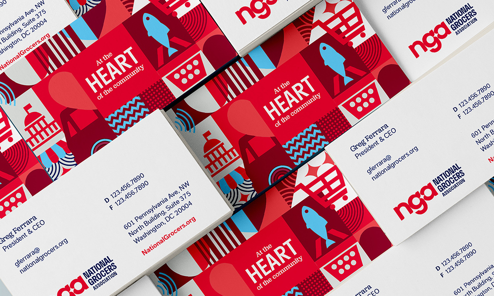
NGA’s rebranding also contains lots of secondary elements, as seen on the association’s business cards. (courtesy Grafik)
Ernie Smith is a former senior editor for Associations Now. MORE
Got an article tip for us? Contact us and let us know!


Comments