Wikipedia and the Redesign That Was Barely There
When the Wikimedia Foundation redesigned Wikipedia recently, the organization's developers did the minimum possible to refresh the look. Sure, it doesn't look like much, but that may not necessarily be a bad thing, considering the organization's cultural parameters.
It was perhaps the world’s most modest redesign, small enough that most people would barely notice, but big enough that it changed the online experience for hundreds of millions of people.
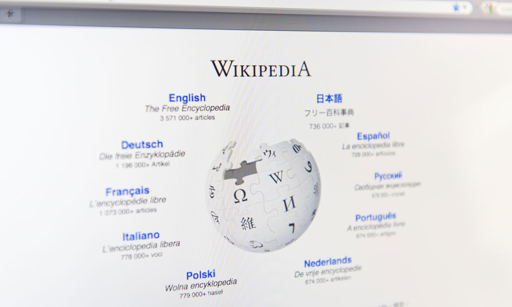
I’m talking about the redesign of Wikipedia, which took place last week and consisted, essentially, of a couple of modest font changes on its article pages.
A compare and contrast of Wikipedia’s recent font changes, with the newest changes shown at the bottom. (Wikimedia foundation)The redesign is anything but radical. The body text is slightly bigger, the typography a little more varied (Helvetica Neue, a typeface most commonly found on Apple products, is now one of the defaults), and the use of fonts and color is a little more consistent across platforms. I know, I know: huge stretch.
But even this microscopic update drew a number of haters, as exemplified by the comments on the blog post that announced the change:
This is a catastrophe. The readability is below zero. Please let somebody do this who has an idea of what he is doing.
Wait, there were more:
There will be no donations from me until these changes are reverted.
It’s clear nobody likes it, please change it BACK. WHY are sites going for larger, fisher price style fonts? And using serif with sans serif, pure ugliness.
Considering these comments along with what you probably already know about Wikipedia, it’s not surprising that there was another redesign—one that, while still modest, took things a little further—that was rejected by the community in a sea of knee-jerk reactions filled with frustration. As a longtime designer myself, it saddens me to hear that efforts to improve the site’s use of white space and get rid of unnecessary borders were killed by frustrated users.
In some ways, though, those users have a point. Hear me out.
Voice of the People
The Wikimedia Foundation is one of the world’s largest charitable nonprofits focused intently on the spread of information. That’s a pretty heady task and a mission that makes millions of lives easier. (And, as a great side effect, makes cheating during bar trivia nights incredibly easy.)
It’s the opposite of Facebook or Twitter; one genius or group coming up with a great redesign doesn’t fit with the foundation’s ethos.
And with the organization’s revenue and content coming almost entirely from the foundation’s substantial donor base, the public literally has a say in just about everything.
Wikipedia’s redesign doesn’t rock the boat. But you know what? That’s exactly the right approach for an organization whose culture is user-driven to the extreme. It’s the opposite of Facebook or Twitter; one genius or group coming up with a great redesign doesn’t fit with the foundation’s ethos.
Sometimes, big radical changes make sense. A while ago, a somewhat rogue exec at eBay went on a secret mission to redesign that site. He didn’t tell most of his coworkers. Instead, he convinced a tiny skunkworks team to head to Australia with him, where they rented an apartment using Airbnb and got to work. When they made it back to the States, they had a radical redesign that the company jumped on. It was a smash hit.
That’s great, and I hope more organizations try that approach, but if Wikipedia did that, there’d be some online version of rioting in the streets. It goes against everything the organization stands for. In fact, there have been many efforts to redesign Wikipedia through unsolicited means, and they never go over. Wikipedia cast its lot in the vox populi a long time ago.
I’m not saying I don’t wish that Wikipedia had a better design, but really, they have bigger fish to fry. Your site probably doesn’t still have to look good on Internet Explorer 6; Wikipedia does. Wikipedia has to load fast, whether the user is in Silicon Valley or Swaziland. And with as many pages as Wikipedia has, they have to make sure that whatever design changes they make don’t ruin the experience for either the editors or the public.
Culture Matters
Obviously, there’s a lot of second-guessing about this move. It goes against the traditional management strategies that drive redesigns; it feels like the strategy was to turn the public into project managers.
But that works for Wikipedia. It most likely doesn’t work for your organization, where the goals are different. That’s why stories like the British Medical Association’s launch of its mobile site to match its growing smartphone user base are just as important as hearing how Wikipedia went incredibly modest with its design. Maybe Wikipedia could have pushed it further. But would it have matched the audience’s needs?
You know your audience. You should know when you can go bold and when the best you can do is change the fonts up a little.
Now, if you’ll excuse me, I’m gonna read up on some Moon landing conspiracy theories. I may or may not notice the fonts.
(iStock Editorial/Thinkstock)
Ernie Smith is a former senior editor for Associations Now. MORE
Got an article tip for us? Contact us and let us know!


Comments