Does the Banner Ad Still Make Sense in 2016?
The recent move away from text-based content online may be a side effect of the fact that banner ads just don't work all that well. But a major trade group, along with The New York Times, is trying to rethink the ads in a way that could actually produce a balance between content and commerce. Here's the scoop.
If you haven’t had a chance yet, go read this piece I wrote last week about a Pew Research study that highlights the way that young adults (a.k.a. millennials) read text online.
It’s OK. I’ll wait. I’ll trust you to return.
… (taps fingers) …
So, yeah, that’s a pretty surprising result, isn’t it? It plays against what we’ve been led to believe is the best way to reach younger audiences. That doesn’t mean Snapchat doesn’t have its place, nor does it mean Instagram doesn’t matter so much, but instead, it means that there’s still plenty of room to reach users of all ages through the written word.
So why is there so much momentum behind getting us to leap toward visuals? I’d argue that the reason has little to do with the tastes of the audience and more to do with the needs of the advertiser.
Simply: Banner ads just can’t compete on an engagement level with mediums where the transition between advertising and content is less distracting and more engrossing. Listen to your average podcast, just as an example, and you’ll often find the ads just as interesting as the stories. But banner ads? They’re wallpaper. They often get in the way of your content and add little or nothing to the mix.
And the effectiveness of the ads is often called into question. Last month, Forbes legal writer Daniel Fisher wrote that fewer and fewer plaintiffs are collecting the payments they are eligible for under class action settlements, largely because attorneys rely too heavily on online banner ads to provide notice to potential claimants.
Considering all that, the rise of native advertising or influencer marketing makes sense. But what if the solution to this problem is a more thoughtful banner ad?
That’s the tactic The New York Times is trying out. Last week, its crosstown rival The Wall Street Journal revealed that the Gray Lady was effectively abandoning the cross-device ad distribution tools offered by companies such as Google and Facebook, and replacing them with its own offering.
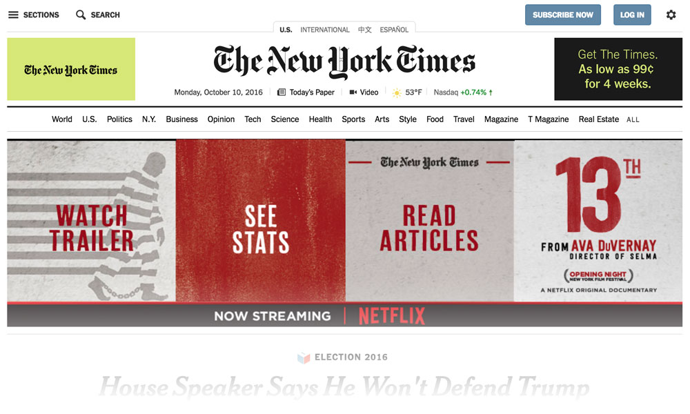
As if to underline the point, the Times plans to ditch the standard 300-pixel-wide ads that you’ve seen on just about every website that serves advertising (including this one). In its place will be ads that automatically resize and reshape themselves based on the layout of the page. (An example from the Times‘ front page is shown above.) If a text ad makes more sense for a specific use case, that’s what the software will throw out.
This gives the Times a level of control over the experience that has previously proven difficult with banner advertising because those modular shapes limited how well the ads merged into the overall experience. Sebastian Tomich, the newspaper’s senior vice president of advertising, noted that publishers haven’t leveraged their market power in a way that maximizes the advertising.
“The way advertisers are using Facebook is very native, for example, but you haven’t really seen many publishers using that model,” Tomich told the Journal. “There’s a good amount of negativity around the display business in the market now, but it’s a staple for us.”
IAB Overhauls its Ad Formats
The association world is abreast of this kind of change, too. Last month, I reported on an industry effort to ensure online video ads work properly in a variety of contexts, but it goes deeper than that.
The Interactive Advertising Bureau has been taking steps to revamp its thinking on banner ads. For years, IAB promoted a series of “rising stars”—standardized ad formats with interactive elements that were intended to expand on the ad’s message. But as AdExchanger reported last month, IAB is moving away from promoting those ads.
Now, the bureau is moving toward advertising that works in different ratio sizes, meaning that they allow much more layout flexibility. In other words, instead of a standard-ratio 300×250 ad, a 1:1 ratio ad would fit the width of the given space, whether it’s 400 pixels wide or 230 pixels wide. (Above is a sample of a 1×2 ad.)
Additionally, heavy interactive elements like auto-play video and formats that pop up on your screen will be discouraged.
(By no means is IAB moving away from interactivity, however; the organization included virtual reality formats as part of the new ad portfolio.)
In a news release, IAB’s Randall Rothenberg also noted that the strategy leans on the bureau’s “L.E.A.N.” ad principles, a noninvasive advertising strategy that the group introduced about a year ago.
“It is imperative that we create new de facto standards that put user experience, control, and cross-device behaviors first—and this new portfolio delivers,” Rothenberg said last month. “Its flexible ad units will allow for creative to scale to different sizes without losing any of its original messaging and impact.”
The formats are up for public comment until November 28.
Meeting Users Halfway
The problem with banner ads has long been one of expectations. They don’t work as well as they could, and because of that, they’ve often been stretched in ways that discourage users from wanting to view them. (Hence, the rise in ad blockers.)
Advertising is clearly an important part of the association revenue pie, but it has to mesh with what you’re already doing. Native ads and influencer marketing, some might argue, can take things too far without firm boundaries in place.
Banner ads have the opposite problem. They’re too confined by their boundaries. That’s why these two efforts are so important—they could eventually get us closer to an elusive ideal.
That ideal? Someday, the banner ad might not actually stink.
(iStock/Thinkstock)


Comments