Rebranding Lessons From the University of California
A wide-scale rebranding of the school's educational system is far from a hit with current and former students. How would you handle a change if it were to go south with your members?
It may seem like window dressing, but graphic design really gets people riled up.
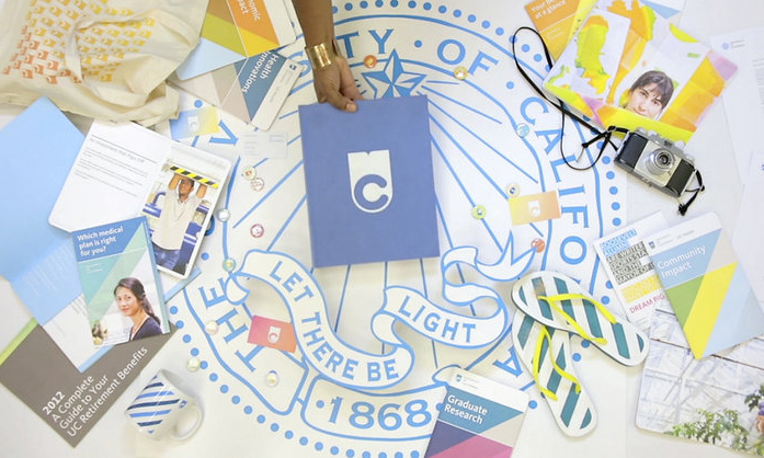
That’s what the University of California system found out after it created a new logo and branding campaign to modernize the school’s image. Students and alumni alike didn’t like it. Despite large structural problems (including funding woes) in the university system, which covers 10 separate campuses and includes more than 200,000 students, it was the new logo design—which some have compared to a toilet, or a computer operating system’s buffering symbol—that got people talking.
Anything you can learn from this controversy? More details:
http://vimeo.com/53530934
The change: As part of a larger rebranding effort, the University of California system recently announced a redesign of its logo and visual presence, in an effort to assist in long-term funding efforts. Talking to Fast Company, Vanessa Correa, the school’s creative director, explained the thought process behind the change—particularly how a book she created played a role in restoring funding to the university system. “[It] softened the ground for the more holistic change we were envisioning, and helped everyone understand the power of design for social engagement and change,” she said. The video above shows the logo and branding approach in action.
The reaction: The reaction to the logo redesign was fierce—with many students upset that the mark replaced nearly 150 years of tradition with a modern design. (As it turns out, the original mark isn’t going anywhere and will remain as a supplement to the new logo.) Some of the comments have gotten personal—Correa, for example, has faced a number of attacks on Twitter from upset students and alumni. “Your design is bad and you should feel bad,” a former UCLA student wrote to Correa. Meanwhile, a Change.org petition regarding the logo has drawn more than 44,000 signatures, and memes mocking the changes have shown up on Reddit and other sites.
This is not an either/or situation—we are not trading in the seal for the new mark.
The university response: Kirill Mazin, the lead art director on the project, took an active role on Twitter defending the project, telling one critic, “My thinking was that a cutting-edge research university should not be represented by a mark from the Victorian era.” He also noted that the design would stand the test of time. Meanwhile, Jason Simon, UC’s director of marketing communications, opened a dialogue with the Change.org petitioners, offering a response that helped clear the air: “Feedback, and dialogue, are essential in a university setting and we are paying attention. While doing so, it’s important that we provide some more context to people who are coming to this issue completely cold,” he wrote. “This is not an either/or situation—we are not trading in the seal for the new mark.”
Let’s say your association made a similarly dramatic change in branding or approach—how would you handle it? Is the University of California on the right track to reining in the controversy? Let us know in the comments.
(University of California/Vimeo)
Ernie Smith is a former senior editor for Associations Now. MORE
Got an article tip for us? Contact us and let us know!


Comments